
At Blue Frog, we develop reports on a daily basis and have had the opportunity to work with many businesses to create comprehensive reporting dashboards. To design a reporting strategy that provides actionable insights, it’s important to start by asking the right questions. Below, we’ll discuss some important overarching questions to ask as well as how the answers to these questions can help you devise your strategy.
What are your goals?
Before you begin building marketing reports, it’s essential to define your business goals. Identify the key metrics you want to track and the specific insights you hope to gain.
Here are some examples to get you started:
Sales Goals
- Increase revenue by 20% compared to the previous year
- Close 50 new deals per month
- Increase conversion rate from leads to customers by 10%
Marketing Goals
- Generate 500 new leads per month
- Increase website traffic by 30%
- Improve email open rates by 15%
- Increase social media engagement by 20%
Customer Service Goals
- Respond to all requests within 24 hours
- Achieve 90% customer satisfaction rating
- Reduce average resolution time by 20%
- Increase customer retention rate by 10%
Financial Goals
- Increase profit margin by 5%
- Reduce operating expenses by 10%
- Increase cash flow by 15%
- Reduce accounts receivable days by 10%
Detailing your goals will best enable you to identify the most important data points to track and the dashboard visualizations that will be most beneficial. As you track progress towards these goals, you’ll gain visibility into areas of success as well as opportunities for improvement, allowing you to adjust strategies as needed to stay on track.
Who is your audience?
Different stakeholders have different reporting needs. It’s important to identify who will be using the dashboard on a routine basis and what they need to see from it. A marketing team might want to see lead generation and conversion rates, while a sales team might be more interested in pipeline velocity and revenue forecasting. Understanding your audiences’ needs will help you design a dashboard that is tailored to how they will make decisions.
Marketing Teams
Marketing teams are responsible for generating leads for the sales team and driving engagement on the website and social media. Therefore, they might be more interested in metrics such as website traffic, lead generation by source, conversion rates, and performance of marketing campaigns. They may also want to see insights around customer behavior, such as which pages are most frequently visited and which lead to the highest conversions, what blog content is the most popular, and which social media platforms are driving the most engagement. This information will help them identify the marketing strategies that are the most effective.
Sales Teams
As a team responsible for closing deals and generating revenue, they tend to be most interested in metrics related to pipeline velocity, revenue forecasting, deal size, and win/loss rates. They may also benefit from insights on individual sales reps’ performance, such as total deals closed each month and average deal sizes. This information will help sales managers identify who is performing the best, which deals are likely to close, and which areas of the sales process may need improvement.
Customer Service Teams
Your customer service team is responsible for ensuring customers are satisfied with their experience and have access to resources to resolve any issues they have. These teams tend to be interested in metrics related to customer satisfaction rates, response times, resolution times, and the types of issues their customers face. They can benefit from understanding how individual service reps perform, including information about workload and average resolution time.
Roles Within Teams
In addition to identifying what metrics will best benefit a department, it’s also helpful to customize dashboards for their intended users. For example, a sales manager may need to see overall team performance, but individual reps would benefit from dedicated reports that help them be more productive, such as those that identify deals likely to close soon or contacts with whom they haven’t followed up within a specified amount of time.
What data sources will you be using?
Your reporting dashboard will be only as good as the data that powers it. Before you start creating reports, consider the following:
Identify the data sources you need.
To create a report, you first need to identify the specific data sources and property values that will populate it. This could include data from your website, social media platforms, CRM records, or other marketing and sales tools your team utilizes. For example, you might need to create a report to track lead generation, website traffic, form submissions, and campaign influences. By identifying the needed data sources upfront, you get a better idea of the lift required to create the report.
Evaluate the data you already have.
HubSpot has a wealth of data already available to you, but there may be other metrics you need to start collecting to build the reports you want. This could include assessing data quality, identifying data gaps, and determining whether you need to cleanse data or restructure its formatting before using it in your reports. For example, if you want to track lead conversion based on region, you’ll want to ensure you are capturing accurate region information like country and/or state and that all values are consistently formatted.
Consider external data sources.
You may need to integrate your reporting platform with external data sources to get a more comprehensive view of your business and make more informed decisions. If so, put in the effort required to make that integration happen. Be sure to understand whether the platforms have a standard integration that your admin can connect or require an advanced solution from an integration specialist using APIs or private apps. Develop a clear understanding of the data you’re currently working with as well as data you may be missing to make informed decisions that are aligned with your business goals.
What timeframe(s) will the dashboard cover?
Dashboards can be set up to show a variety of timeframes, but it’s important to understand what timeframes will be most valuable for fueling data-driven decisions. Your dashboard might cover a specific time period, such as a month or a quarter, or a variety of timeframes. In some cases, it can be beneficial to compare data from the whole year to data from the last month. While you can vary timeframes, remember to incorporate those that accurately depict performance for the chosen data sources.
How will you measure success?
Once you’ve identified your key metrics, it’s important to set targets for success. Develop a clear understanding of how you will measure progress towards your targets, how often you will review your progress, and what actions you will take if you’re not on track to meet your targets. This will help you stay on track with the reports you create. Adding too much clutter to your dashboard can distract you from your main goals and deviate from your success metrics.
How will you organize the data?
When designing your dashboard, it’s important to consider how you should organize your data. Consider questions such as
- What type of visuals will be most useful? (e.g., graphs, charts, tables, counts)
- Can you use colors you to connect multiple reports or clarify the data?
- What order should your reports be in to tell a story and lead a conversation?
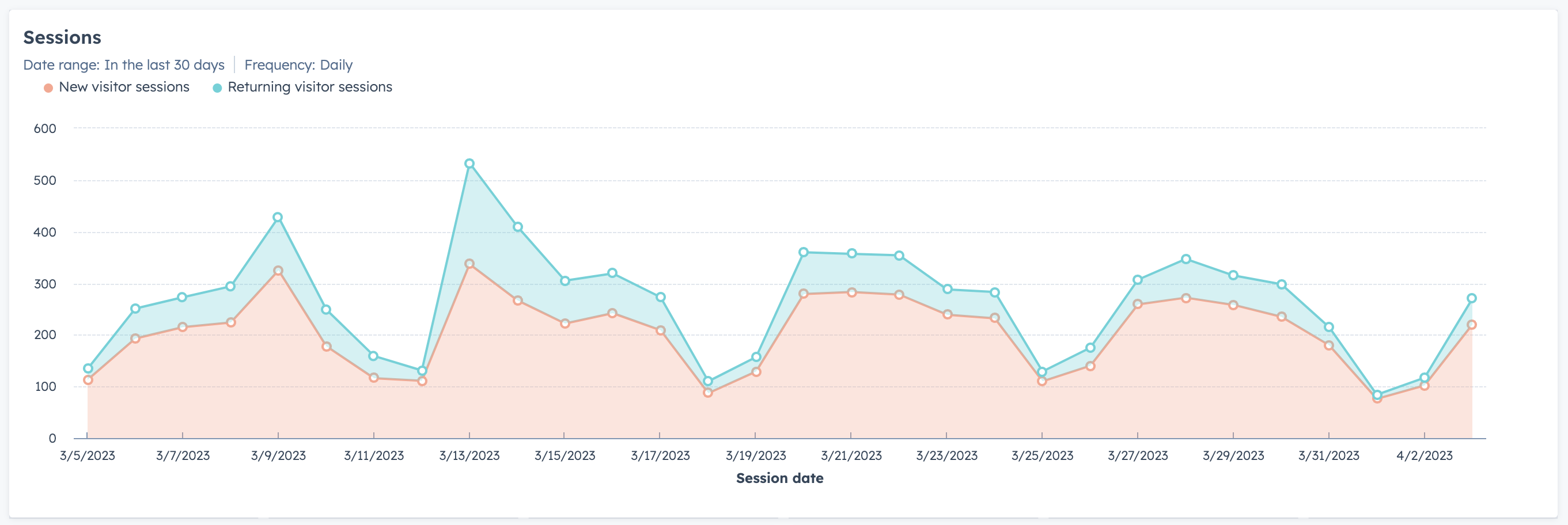
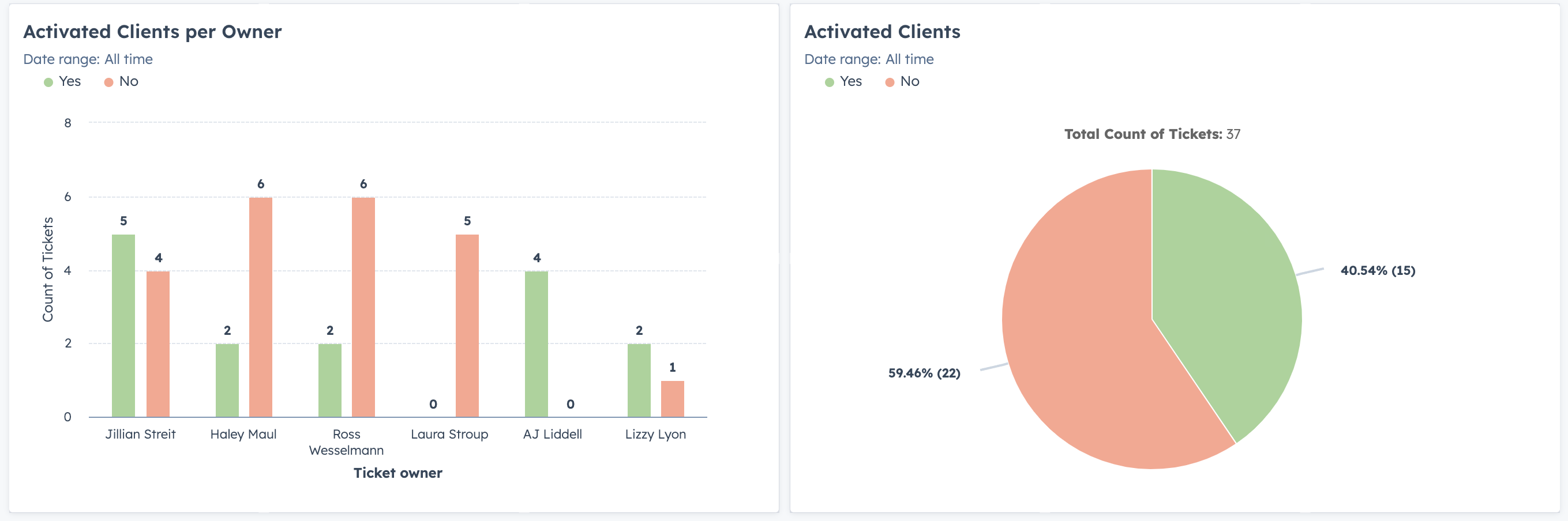
Graphs & Charts
Graphs and charts can make complex data easier to digest. For example, a marketing team might use a line chart to illustrate website traffic trends or a bar chart to compare performance of various marketing channels. A sales team might use a pie chart to break down revenue by product line or funnel charts to visualize conversions and close rates.
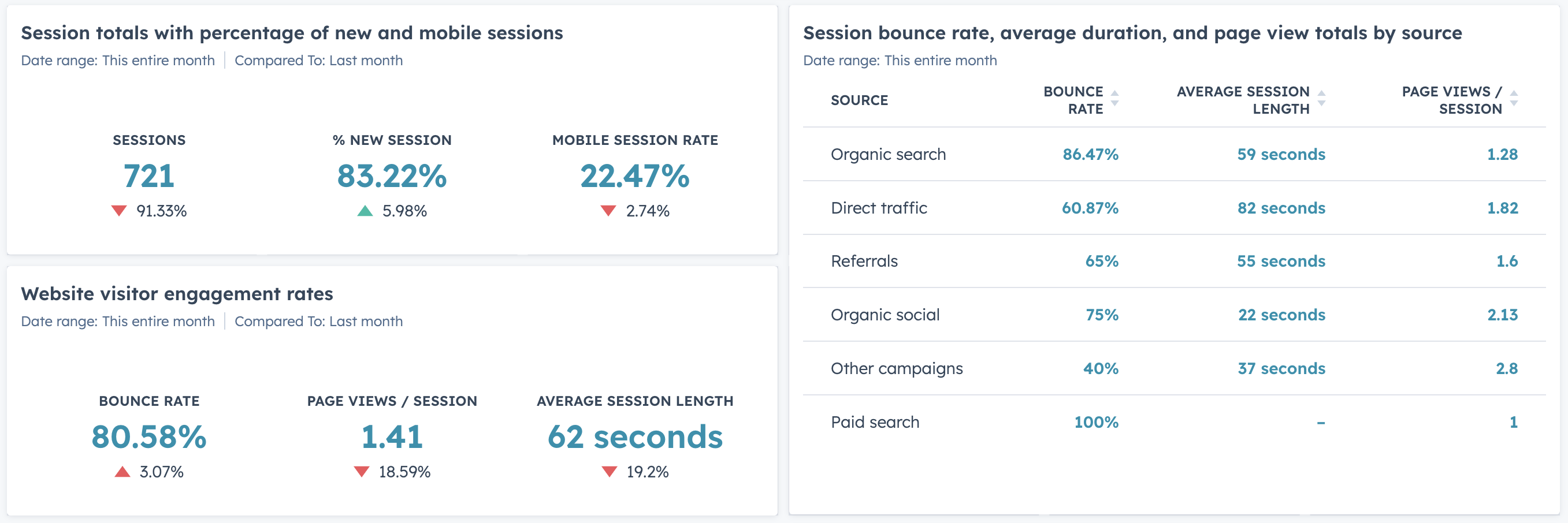
Tables & Counts
More number-focused data tables and numeric counts can allow customer service teams to view the number of currently open tickets or display them by type and status.
Color Coding
Color is a powerful way to help viewers of the dashboard quickly identify important information or connect like elements together across multiple reports. For example, you could use red or green to highlight whether a metric is above or below target or use specific colors to represent different categories or timeframes.
Storytelling
The order in which your reports are presented in the dashboard can also impact how easily viewers can understand the data. By creating a logical structure, you can make it easier to understand how metrics are connected and how changes in one area can impact others. When a dashboard is easier to understand, it becomes easier to use the data to identify trends and improve operations.
How will you maintain and update your dashboard?
Once your dashboard is built, it’s important to have a plan for updating and maintaining it. Ask yourself these questions:
- How often will the data used in the report updated?
- Who will be responsible for maintaining the dashboard?
- How can you ensure the data used is accurate and routinely up to date?
These questions will help you understand the maintenance effort that will be required to keep your dashboard running smoothly and working effectively for you. The more a dashboard updates and maintains itself, the easier it will be for your team to use the insights over time.
How will you communicate insights?
Because the purpose of a reporting dashboard is to provide insights that drive decision making, it’s important to determine how you will communicate insights or reports to your key stakeholders. For example, you might provide reports to the team on a recurring basis or hold meetings to discuss the data.
Also consider how you can ensure stakeholders understand the insights provided in the dashboard. Using a tool like HubSpot, you could set up your dashboard to be emailed to key stakeholders on a recurring daily, weekly, or monthly basis and add explanations and insights to call attention to certain trends or remind stakeholders about what the report is showing.
Getting Started with Your Reporting Strategy
A well defined reporting strategy can provide numerous benefits for any organization. By creating a reporting strategy, you can gain clarity and insight into your operations, identify areas for improvement, and make better data-driven decisions that can positively impact your business. Using the questions outlined above, you can set your strategy on the right track from the start, help your team focus dedicated dashboards on the most important metrics, and avoid overwhelming your dashboard with irrelevant data.
A robust reporting strategy can improve communication within your organization and foster a culture of transparency and accountability. By setting clear expectations for what data you should be reporting and how it should be presented, you can help align your entire team on common goals. Additionally, a well developed reporting strategy can save your team time and resources by streamlining collection and analysis efforts. With less time spent collecting and manually reviewing data, your team can focus on strategic decision making and operational improvements.
For more tips on optimizing your marketing and sales efforts, subscribe to the Blue Frog blog.