Mobile usage has changed how users and search engines interact with websites. As mobile searching becomes more and more common, search engines have adapted to meet the growing demand for mobile friendly and optimized websites.
Mobile friendliness has been a ranking factor in Google search results for many years, and according to Backlinko, is among the highest impacting ranking factors.
If you want your site to rank on Google (or any other search engine), mobile optimization should be a high priority for you. In fact, Google recently announced that it will be “switching to mobile-first indexing for all websites starting September 2020.” This is a big deal. Mobile-first indexing means Google bots will only crawl the mobile version of your website. If any pages are not optimized for mobile use, they will not appear in search results.
When it comes to preparing your website for mobile optimization, there are things to consider for both search engine robots and user experience. Follow these tips and recommendations to set up your website for mobile-friendly success!
For ALL of our favorite SEO tips and recommendations, download the Local SEO Checklist.

Tips for Optimization
There are many things to consider when optimizing your website for mobile use. While mobile-friendliness is a significant ranking factor to search engines, you cannot forget to prioritize user experience.
If your site is properly optimized in Google’s eyes but does not function well for the user, you may see a high percentage in bounce rate and a low time on page. That’s the difference between your website being “mobile friendly” and “mobile optimized.” You may find that your website passes all of the mobile friendly tests and appears in mobile search results, but it may not create a positive user experience.
Consider this sidewalk design for a moment...
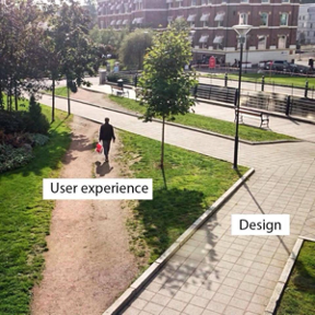
This park has a beautifully designed sidewalk path for visitors to use but it is not the most convenient route. As a result, visitors end up cutting corners and making their own route, which ultimately hurts the look of the park.
This is what you should keep in mind when optimizing your website for mobile devices. Start with a foundation built for search engines (the design), then optimize it to meet the needs and desires of your users. Consider what paths THEY want to take in order to get where you want them to go. To help you get started, here are 10 tips to optimize your website for mobile use!
1. Use a Responsive Design
Responsive web design is one of the newer strategies for approaching website design. Responsiveness means the website adapts the size and organization of the content on the page to fit the specific device a user is viewing from. This type of approach often leads to a better user experience and search engine optimization value.

As more and more types of devices are created and screen sizes continue to change, it is important to have a website design that can function properly under any circumstance. Even when users switch the orientation of their device (landscape vs. portrait) or alter their system preferences to use larger text sizes, a responsive design will ensure your website still looks and operates as it should.
2. Consider Phone Sizes and Holding Positions
When designing the desktop version of your site, there is a lot more freedom on where modules can go. But for mobile devices, there are limitations you may not have considered initially. For example, how people hold their mobile devices can impact how much of the screen is easily accessible, thus, influencing their available interactions with your site.
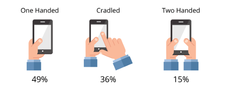
Looking at the graphic of common mobile phone positions above, you can see the most popular way of holding a phone is one handed with use of the thumb. Of all three options, this one is the most limited on reachability, meaning the user has a smaller range of motion on the screen.
Understanding your users’ range of motion can help you place clickable content in more accessible areas of the screen, such as avoiding the corners and the top of the device.
You should also think about the sizes of phones commonly used. Phone screens have been getting larger, which means you can fit more content on the page, but it also further limits the users reach on the screen.
3. Simplify Your Navigation Menu
If you have optimized your website's navigation menu, you are on the right track toward optimizing for user experience. However, mobile screens are substantially smaller than desktop and laptop screens. For this reason, it is recommended to simplify the navigation menu and make it as short and simple to use as possible.
Use of the hamburger menu style has become popular among mobile versions of websites. This menu takes up less space on the screen while ensuring the menu items appear large enough for the user to easily select with their finger.
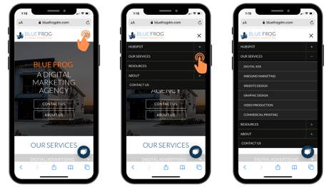
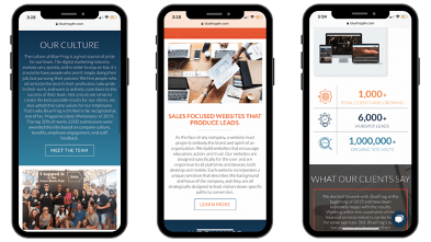
As you can see from Blue Frog’s mobile homepage, the hamburger menu sits at the top where you would expect to find the main navigation menu. When tapped, the menu options appear larger and easily clickable. The hamburger icon also converts into an “X” to make it easy for the user to close the menu if they wish.
4. Simplify Forms
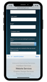
Forms can be more difficult to fill out on mobile devices compared to desktop computers, which is why it’s beneficial to limit the number of form fields you require users to complete. Ensure the form fields only ask for the information that is absolutely necessary to continue and consider minimizing the number of fields that require text entry. Drop downs and check boxes can help to simplify the form-fill process on mobile devices.
5. Optimize CTA Size & Location
Calls to action (CTAs) and clickable elements on a website are important to help users navigate your site and learn more about what your company has to offer. When it comes to CTAs on mobile devices, it is important to optimize the size of the button and consider how far apart each button is from the others as well as where they are located on the screen.
When deciding where to put your CTAs, consider the Gutenberg Principle, which states that users tend to start scanning content on their device from the top left corner of the screen and zigzag their way down to the bottom right corner. Content that falls along the “Gravity” line is more likely to be noticed.

Understanding your users’ scanning habits can help you determine the best placement for high priority CTAs on the page. For example, should a button be at the top or bottom of the page?
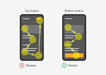
Remember, users start their scan in the upper left (not always at the very top) and move their way down. If there is no clear CTA found when they complete their scan of the content, the user can get confused. This causes a disruption in the flow of completion. For this reason, it is recommended to place your CTAs at the bottom of the relevant content (it’s also easier for the thumb to reach!).
The same process can be used when deciding to put two CTAs next to each other or on top of one another. Which one should be the primary action CTA? Knowing that the user’s gaze will likely end in the lower right corner, it is recommended to place the primary action CTA on the right side or at the bottom.
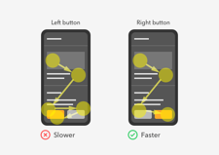
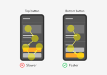
Where you place your CTAs can make a big impact on user experience and action completion rates. Best practice is to make the process for the user as quick and simple as possible. Understanding where your users are looking will help ensure you provide them with the options they need, when they need them.
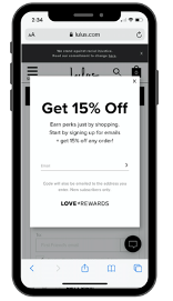
6. Eliminate Pop-Ups
There is no doubt you have probably run into a few un-closable pop-ups while searching a website on your mobile device. Pop-ups are incredibly harmful to user experience, and the more difficult they are to close, the more likely a user is to leave the site entirely.
The best course of action for pop-ups on mobile devices is to avoid using them whenever possible. This includes promotions, advertisements, and any other pop-up you may have in place. If you can, use CTAs that lead to landing pages instead of pop-ups. If you cannot avoid using a pop-up, perform a lot of user testing to ensure it is easy for the user to close the pop-up from any and all devices.
7. Keep Content Short & Concise
With mobile device screens being small and narrow, it can be difficult for users to read large blocks of text. Whenever possible, minimize the text on the page into shorter and more concise statements. Ideally, each content section should be completely visible on the screen. That way, the user does not have to scroll to read the full text. Icons, graphics, and numbers are also great ways to say more with less on mobile devices.
8. Optimize Page Speed
It may go without saying that slow websites are harmful to search engine optimization, ranking, and user experience, but it’s important to remember!
In fact, in most cases, your desktop website speed will differ from your mobile website speed. With Google’s PageSpeed Insights tool, you can get an overview of how long it takes your website pages to load on both desktop and mobile versions.
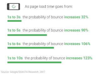
How long did it take your mobile site to load?
If it took longer than three seconds, you may see high bounce rates as a result. This is because over 53% of mobile users will abandon a site if it takes more than three seconds to load, and the likelihood of a user leaving the site increases as the load time takes longer.
The best way to optimize your webpage load time is to simplify the design. Avoid unnecessary images and flashy features as these are usually the leading cause of slow load time.
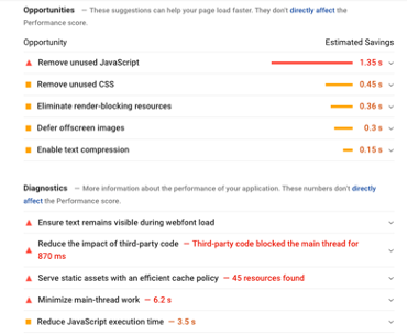
If you use the PageSpeed Insights tool, Google will provide feedback on some areas of opportunity and improvement.
Continually optimizing your website’s load time will provide many benefits to your domain in the long run. It will keep both search engines and users happy!
9. Optimize Images
Images are one of the most common reasons for longer load time for mobile webpages. Properly optimizing your images (even for desktop viewers) will positively impact your website’s SEO, rankings, and user experience.
If you use a responsive website design (as recommended above) you can incorporate responsive images into the site. Responsive images mean the size of the image will automatically adjust and compress to fit different screen sizes and types.
10. Test, Test, Test
Search engines value mobile optimized websites and want to ensure you can properly develop a mobile friendly website. This is why Google designed a free resource to help you test your site’s mobile friendliness and appearance on mobile devices.
Simply input your website URL into Google’s Mobile Friendly Test Tool and click “Test URL." If your site is mobile friendly, you should get a result like this:
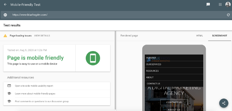
Above the “Page is mobile friendly” section, you may notice a little yellow warning sign with “Page loading issues” next to it. If the mobile friendly test tool identified some loading issues, it will display them for you to see under “view details."
Use this free resource to check your website's mobile compatibility and identify any issues to fix. But remember, just because your website is mobile friendly, does not mean it is fully optimized for mobile devices.
As mobile use continues to become more intertwined with our everyday life, search engines and users will expect websites to keep up with their expectations and ever-changing needs. Use these tips to get your website started on the right track toward proper mobile friendliness and optimization. When done right, your website will see great SEO benefits!
