Typically, web designers and their clients think about websites as desktop sites first and mobile sites second. We tend to design for desktops first because it’s familiar to us, but what happens if we flip that process and design for mobile from the start? Let’s take a look at some of the pros and cons of this strategy.
When a business develops its website, the assumption is that a majority of consumers will be viewing the site from a desktop computer. As a result, the desktop version is developed and designed first, and the mobile site is an afterthought. Mary Meeker, an analyst at Kleiner Perkins Caufield Byers, proclaimed in a headline that swept the nation, “Mobile to overtake fixed internet access by 2014.” The article ran in 2008, the same year that Eric Schmidt of Google exhorted businesses to take a “mobile first” approach to designing web experiences. Today, we’re long past this tipping point as according to Statista, mobile devices accounted for 51.2% of web page views worldwide in 2018. Smart Insights reports that 48% of consumers start mobile research with a search engine. This is why you want to create valuable content that makes it easy for your buyer persona to find you online and why it’s critical to pay attention to how a desktop site is adapting to a mobile interface.
The traditional workflow is this: A web designer designs the website as a desktop-centric site. A developer writes the code to match the design. The website is then modified to adapt to different devices, such as smartphones or tablets. This approach is referred to as graceful degradation, or desktop-first development.
To make graceful degradation possible, developers use a technique called responsive web design. Responsive web design enables a website to automatically scale to fit different screen sizes. This means that a business only needs one website, but often, all of a desktop site’s content and design elements won’t gracefully fit into a mobile site. The layout becomes skewed, and visitors have to scroll through too many elements to get to the actual content. When you design and develop for mobile first, this problem can be easily avoided.
Even though it sounds like the perfect solution, this backwards approach isn’t the norm for most modern web design companies. To understand why, let’s get into the pros and cons of mobile-first website design.
The Pros
Mobile Is Popular
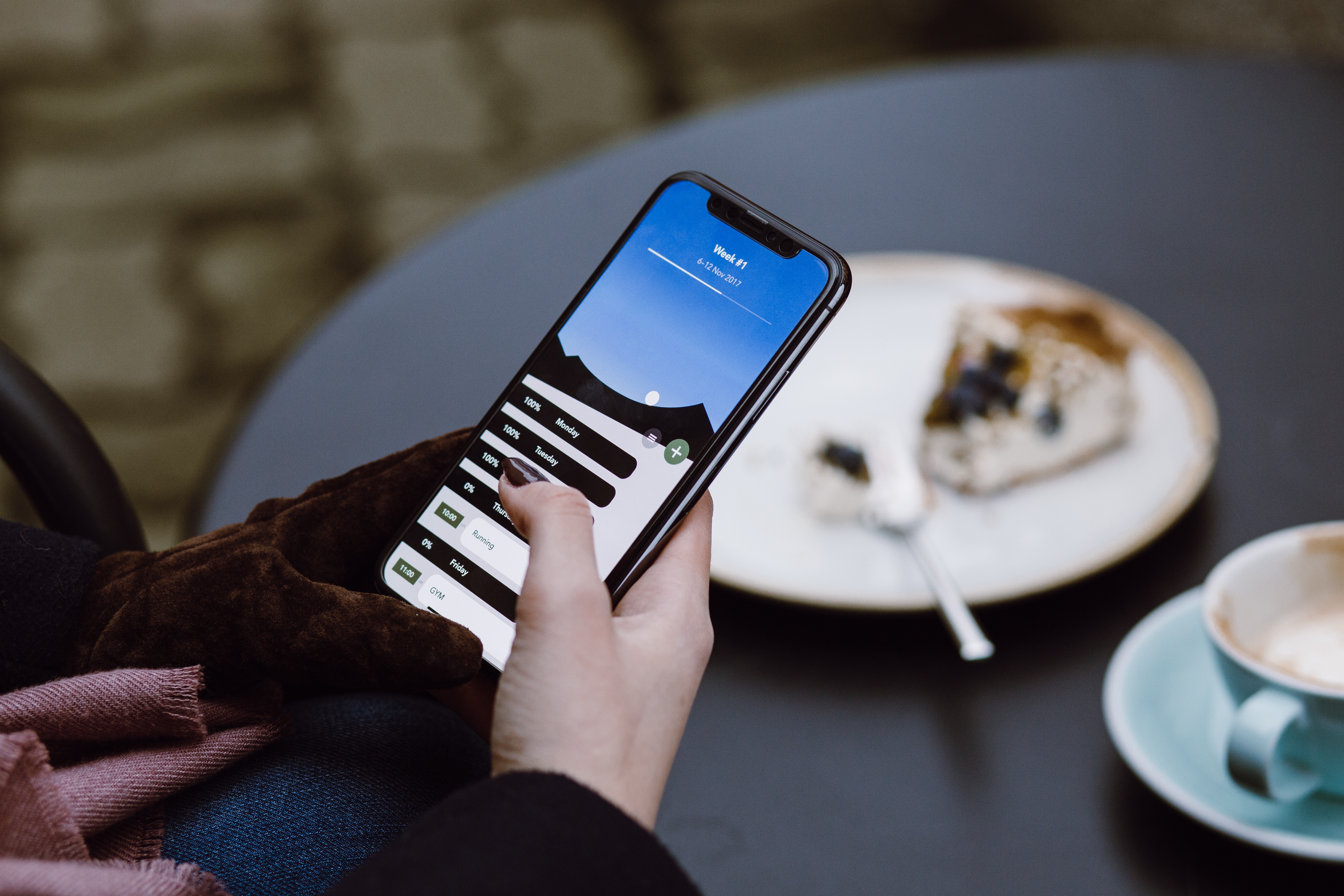
Nowadays, many users will likely only see the mobile version of your site. The web is something that we carry in our pocket, and no longer something that sits in a computer room in our homes. Mobile design should be a first priority for most businesses, and the web development process needs to reflect that.
Content Is King
On a mobile site, content is prioritized above everything else. There simply isn’t room in a 320-by-480 pixel screen for unnecessary elements, so the available space should be used for content that will help users along the buyer’s journey, not for excessive design elements that will get in the way as visitors search for information.
Less Code = Fewer Bugs
A mobile-first approach to coding means that development begins with a simpler code used for mobile devices, and advanced styling and other overrides can be added later via media queries. A desktop-first approach is the opposite; the more complex styling for desktop is written first, and then overrides for smaller screens are added later. Because coding for larger screens is a lot more complicated, coding for mobile first helps to simplify your code and prevent bugs down the road.
Top-Notch UX
The mobile-first approach allows you to create a user experience (UX) that favors mobile devices. Visitors interact differently with desktop sites than mobile ones, and your UX needs to change according to the screen size. Mobile-first design also allows you to progressively enhance experience and content as the screen gets larger.
Faster Download Times
When graceful degradation is employed, all of the content (images, video, audio, etc.) is automatically loaded when a visitor views the site on the largest screen size. Most mobile versions of these websites either ignore or remove many of these elements. The problem with this process is that even when hidden from the user, these elements are still loaded onto the platform, making for slower load times.
The Cons
Everything Is Different
Mobile-first design is neither fun nor easy, and it takes a team that understands the inherent differences of this approach. It requires new work and design methods, and it takes dedication, experimentation, and a vast understanding of the mobile platform.
Restricting Workflows
Web designers often find it very difficult to dive into a design if they are starting with mobile and working their way up. They are hit over the head with restraints right from the start with a smaller screen, fewer resources, and a bunch more headaches. Responsive design is a sandbox, restrictive but forgiving for a lot of creative gestures. Mobile design is formulaic, with just enough rules to lock you into the same boring design that belongs to a lot of other mobile sites.
Clients Want a Wireframe
Clients want to see a demo of their site before they sign off on the design, so creating a mobile-first website can confuse and frustrate them. Because they won’t be able to view the desktop version until the end of the process, this route requires a lot of trust between the client and the web designer from the very beginning of the project.
So, how do you know if you really need to create a mobile-first website? Take a look at your buyer personas. The ideal solution will depend on your clientele, the devices they use, and your budget. Remember that most visitors on your website will not be able to tell the difference between a responsive website and a mobile-first website. What’s most important is that they are able to find the information they need in a quick, easy-to-navigate website.
Do you need help with your website design? Blue Frog can help! We work with clients across the country to design and build functional, beautiful websites. To learn more, contact us today!
