
Have you ever visited a site and just could not find what you were looking for?! It’s a frustrating experience too many visitors have when trying to find information, products, services, or even contact information on a website.
Now think: Is your navigation menu frustrating your website visitors?
Why You Need A Navigation Menu
Navigation menus play a crucial role in user experience, and search engine crawlability. A navigation menu literally tells users and search engine robots where to go next and what pages relate to one another.
Think of your navigation menu like the blueprints of a house. It’s a critical preliminary step in the process of framing your entire website. It’s important to map out what pages you want on your site, and where you want visitors to go. Mapping out your navigation menu can also help you structure and organize your website’s URLs in the process.
Sometimes, it’s not enough to have the map—users need directions too. Your navigation menu should act like a GPS guiding the visitor to their final destination, but how they get there is up to you!
While many foundational aspects of a website should focus more on search engine crawlability, a website’s navigation menu can be more user-focused. After all, that’s who is using it the most!
How to Optimize Your Navigation Menu
There are many components to optimizing your website’s navigation menu: order, drop downs, quantity, etc. At the end of the day, there is no “one-size-fits-all” solution. But there are ample ways for YOU to find the answers that fit your website.
1. Determine the Order & Quantity
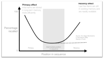
The human memory is a fascinating thing. Ever heard of the Serial Position Effect? Bear with me as I get scientific for a moment (I almost became a biochemist)!
A study was done that asked participants to recall words they only saw for two seconds. The amount of words shown varied between 10-40. What the scientists observed was that regardless of how many words were shown, the participants were more likely to remember the words at the beginning (primacy effect) and at the end (recency effect) of the list.
What does this mean for your navigation menu?
Ever notice how most websites you visit have a products or services tab as the first item in the menu, and a ‘contact us’ button at the end? That is because those sites deem those pages to be the most important and want their website visitors to find and remember them.
When deciding what pages to link to within the navigation menu, and in what order, think about your end goal for the visitors. How much information do they need before reaching this goal? What information will get them to the goal faster? Do they value case studies over ‘about us’ content?
“It’s also important to remember that a majority of users read from left to right and view pages in z-shaped or f-shaped patterns ," Blue Frog designer Elle Scott said. "Placing important links in those sight lines creates a visual hierarchy for the user, showing them where you’d like them to go. “
Studies have also shown that we can only hold about seven items in our short-term memory at a time, which is why it’s recommended to limit your navigation items to seven or fewer. Here are a couple of ways to help you determine menu order and items:
Look at top performing pages
What pages are your visitors already using?
Are there overarching categories these pages fit into?
What keywords are visitors using to find these pages?
Look at low performing pages
Where are they?
How do users get to them?
Look at users’ page path
Where do they start?
Where do they go next?
Where do they leave the site altogether?
Use the information about what pages your users prefer and how they tend to get there to help you order your navigation menu items and establish a hierarchy.
2. Consider Page Depth
Page depth is the number of clicks it takes to get to a page from the homepage. The homepage always has a click depth of 0, any page that is directly linked from the homepage will have a click depth of 1, pages that are linked from that page and not the homepage will have a click depth of 2, and so on.
If a page is too many clicks away from the homepage, it tells search engines that the page is of less importance than those 1 or 2 clicks away. Pages linked far away from the homepage are also less likely to be found by users.
However, it is important to not over link on the homepage. Remember, Google uses page depth to determine page importance and relevancy, so if every page is one click away, it essentially lessens the importance of every page linked from the homepage since Google will view them all as equal.
3. Decide on a Menu Type
There are so many menu types to choose from including; single bar, double bar, side menu, mega drop-down, hamburger, and so on. How do you choose?
A lot of this decision comes down to your industry, user device preference, and type of users.
Mega Drop-Down
While it is often advised to minimize the use of drop-down menus, the mega drop-down is one exception. One of my favorite examples is Wayfair.
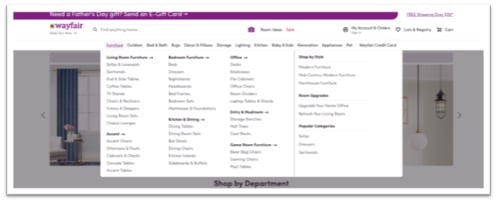
Mega drop-down menus are best used for eCommerce businesses with thousands of products to choose from. Notice that memory effect is still at play here though. Each subcategory within each drop down has between 3-9 options in easily distinguishable categories. Visitors to sites with mega drop-down menus often know exactly what they are looking for and want to minimize the number of clicks to get there.
Double Menu Bar
Keeping your menu bar simple is always advisable, but the double menu bar can prove very useful for sites with user logins or a large social media presence.

If you have many users returning to your site simply to login or quickly call your company, using a double navigation menu can free up space by moving those items above the main navigation and making those items quick and easy to access for returning visitors.
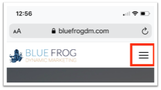
Hamburger Menu
Hamburger menus are most commonly used on mobile versions of sites. Regardless of if your website visitors find your site through mobile devices, it is more crucial than ever to develop a responsive navigation menu as Google shifts to ‘mobile first’ indexing .
These are only a handful of the many navigation menu options out there but remember to prioritize simplicity and clarity for your users.
Another piece of the puzzle to consider is your final goal for a website visitor.
For example: If you want the user to stay on a single page for a while (like reading a blog post) or fill out a form on a landing page, consider more simplified navigation menus or have the menu ‘hide’ when the user scrolls. This will minimize distractions and increase the chances of the user completing the intended goal.
“The navigation design you choose should primarily focus on the user experience, organizing the content in a logical, simplistic way, and enhancing ease-of-use," Scott said. "It’s also important to consider how the menu will respond and function on multiple devices, like tablets or phones."
4. Use Text Links & Buttons
When looking at your navigation menu, is there a noticeable difference between your menu items and a desired call-to-action (CTA) button?
In your navigation menu, it is beneficial to use a mix of text links and CTA buttons to drive users to different areas of the site. Take Blue Frog’s homepage for example:
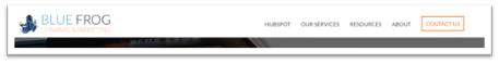
The menu items are simple and easily identifiable, but there is also a clearly differentiable “Contact Us” CTA button. What item you put in a CTA in a navigation menu depends on the end goal for your visitors. Do you want them to contact you? Or download a demo?
However, be sure to limit the number of CTAs you use in the navigation menu to one or two. There are plenty of opportunities to use CTAs throughout the page body as the visitor explores your website.
5. Add a Search Bar
Many users prefer to find pages through search bars. You can include a search bar, or an expanding search bar icon in the navigation menu to cater to those users.
If you are still not sure what words to use in your navigation menu, a search bar can help you figure that out. By looking at what words visitors type into the search bar the most, you can determine what content your site’s visitors are trying to find or where your current navigation menu is lacking in clarity or direction.
6. Link Logo to Homepage
It has become customary to link your logo back to the homepage of the website. Users have grown accustomed to this feature, and often expect it. Where many sites used to use a navigation menu item to link to the homepage, using the logo frees up a spot in the navigation menu for another category.
7. Use Descriptive Words
The words you use in your navigation menu can have a large impact on user experience. Think of it in terms of GPS directions. Do you want your users to “turn left in 2 miles” or “turn left on Alice’s Road?” Those two phrases may indicate the same action, but one may be more beneficial to your users.
Look into the keywords people use in search queries to find your website. What keywords are used to find your competitors? Is there overlap? Are there words you may be missing? Does it make more sense for you to use broader terms like “products” or more specific industry terms like “marketing services?”
8. Minimize Creativity
While you want your site to be creative and stand out from your competitors, the navigation menu is not the place to break the status quo. You want users to spend lots of time on your site, but it shouldn’t be spent trying to figure out your navigation menu.
Look at what other sites in your industry are doing. Find ways to be unique, while ensuring your visitors will understand the terminology in your navigation menu.
9. Maintain Consistency
Your navigation menu should look the same on every page of your website. Users will get confused and frustrated if the navigation menu switches places or terminology from page to page.
"A consistent, predictable navigation menu helps users explore the site with ease and find the information they seek," Scott said. "By providing the best experience possible, your site should exhibit low bounce rates and better time on page, which are both factors search engines use to determine relevancy.”
Your website navigation menu is the central hub for all your pages. While search engines can use navigation menus to crawl websites and determine page structure, they are more influential to user experience. Understand your website visitors, decide your end goal, and you are well on your way to building an optimized navigation menu.
Want more local SEO tips? Download the Local SEO Checklist.
