Over the past decade of designing websites, Blue Frog has seen design trends come and go at an increasing pace. Throughout the rest of 2018, thousands of companies will be trying new and innovative designs to help create a better user experience and encourage engagement. With more competition than ever before, web development firms are pushing the boundaries of elegant design and lightning speed.
We'll review ten design elements that can make your website stand out:
- Animation
- Colors schemes
- Typography
- Product Visualizing
- Illustrations
- Gradients
- Responsiveness
-
Minimal - Shadows and flat design
- Broken grid layouts
1. Elegant Use of Animations
Animation isn’t just for cartoons; it’s a great way for your business to keep users’ interest and increase the time they spend on your web pages. A full spectrum of animated elements is available to help you engage visitors, from small hover effects to full-screen moving images.
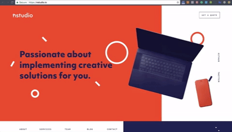
There are thousands of examples out there of websites that do animation really well, but this is one of my favorites. If you don't know exactly what's going on here, nstudio is using a lot of different types of animations. When the user scrolls, elements fly in or load in dynamically.
The page loader at the beginning of the video 1) lets the user know that the website is loading, and it's okay to stick around—the website isn’t broken and 2) shows off the unique flavor of their brand. Animations are not simple from a development perspective, and although extensive research hasn’t been completed on micro animations, they are still important to incorporate on your website. Making sure that all of these elements are animating in a way that makes sense for the user and also keeps them engaged is something we think a lot about here at Blue Frog.
2. Bright and Bold Color Schemes
Colors are a bit harder to portray on a website, especially if you have established brand colors and won't be re-branding anytime soon. However, depending on the audience you're trying to attract, bright and bold colors are a great way to portray you business as something fresh, new, and exciting.
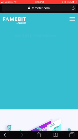
Take FameBit for example:
-1.gif?width=480&height=220&name=giphy%20(1)-1.gif)
As you can see, the bold colors help draw your eye to the subjects that matter most, so highlighting the value propositions or calls to action is much simpler. Even more importantly, you can see how easily bold colors highlight what's most important when viewing on a phone.
Although we did not design this site in particular, all web design projects Blue Frog develop have a heavy emphasis on an optimal mobile experience.
3. Contrasting Typography
Designers have been using fonts of different weights for years now, and for good reason; it separates different types of content and draws the eye to what's most important. Usually, on the development side, this is dictated by header and paragraph tags, which serve the additional purpose of telling Google what's most important on your page.
Designers are starting to use fonts that contrast even more dramatically to 1) create a better user experience, 2) create fonts that their customers really love, and 3) freshen up their brands. By doing this, users have an easier time digesting which content is most important, and help them skim the information faster.
Below is a great example of how contrasting typography can help your users understand what you’re trying to convey faster:
-1.gif?width=480&height=270&name=giphy%20(2)-1.gif)
The Lincoln does a great way of showing off and contrasting their fonts. Using a bold header makes it easy for the user to know what they should be focusing on, and an all caps smaller description is an easy way to add context. For additional inspiration, you can check out these font pairings here.
4. Product Visualizations
Showing off your product or service sounds like common sense, but this is often overlooked (or not done as well as it should). The main reason people come to your website is to see what you have to offer, so why not show it off?
One of the design tools we use in-house is from a company from InVision. Interestingly enough, one of the reasons we decided to work with this vendor is because they did such a good job of portraying their products and educating us BEFORE we needed to talk to any sales reps.
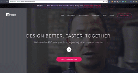
As you can see, the text on the other side of the pictures details what the user is looking at and also includes a testimonial about that feature. The site also layers pictures with callouts of specific features to provide added clarity. InVision is a company that really brags about its product, but it does so in an educational way that’s valuable to its users.
5. Story-Telling Illustrations
Illustrations are not only a great way for you to showcase your products; they help portray a story to your users. Take Pitch, for example:
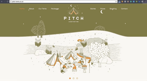
Illustrations are a fantastic way to not just speak directly to your target market but to tell them a story. As you can see, Pitch's illustrations show many different settings in which its products can be used, speaking to each of its different demographics. This strategy eliminates the need for a picture-heavy website, and instead, focus on the story and educating the viewer.
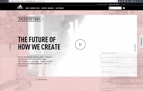
6. Crafty Gradients
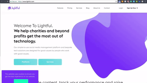
Lightful is an excellent example of web gradients done right. Using gradients is an excellent way to add pop and flair to your website. Gradients are becoming a hot trend once again, but the focus is on new palettes and cool colors. You'll notice lots of purples, greens, and blues in the majority of websites using gradients.
Gradients are also effective for splitting up sections of content, creating more visual interest than using a single color. Most sites use a picture with a transparency over the top or a light shade of gray. Check out this example:
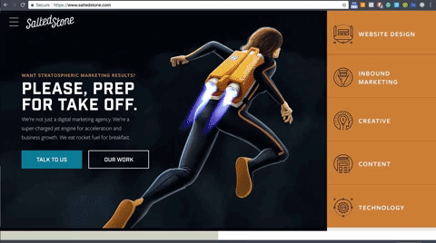
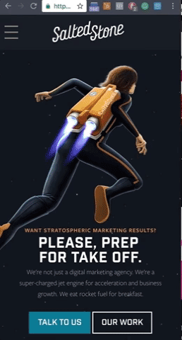
7. Smooth Mobile Responsiveness
Now that people carry computers in their pockets, it's more important for your website to work on a range of screen sizes. Because people are conducting more of their online searches on mobile devices, it's imperative that your website not only gets in front of your potential customers, but also that it’s optimized for their use.
Salted Stone on Desktop
Salted Stone on Mobile
8. Minimalism focused E-Commerce
Minimalism has been a really hot trend over the past couple years. Minimalism focuses more on user experience than on SEO. A minimal design features high contrasting negative space in order to not overwhelm the user and make calls to actions more clear. On the other hand, a minimal design means minimal copy, which means sacrificing keyword density for a better visitor experience. However, that's not necessarily a bad thing.
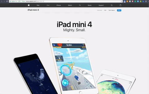
See how well Apple's website draws your eye to their products instead of portraying their brand on you? They are completely product focused instead of trying to portray the lifestyle of their user.
Compare this to Tinker:
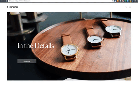
Notice how the simple layout with mute colors allow you to focus on the products. Tinker places a larger focus on lifestyle and branding, but the design is still minimal and focused on showcasing their products.
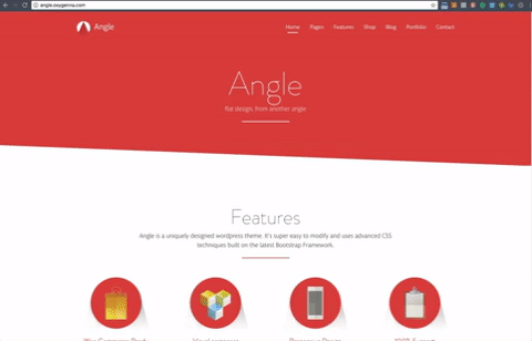
9. Shadows and Flat Design
The flat design trend has existed since the 90s, but it's evolved by the addition of depth. The original operating systems featured icons that were highly detailed instead of the line-icon experiences we see today. Over the last few years, designers are starting to combine these elements to not only pay homage but to also create new design styles.
Here is an example of traditional flat design:
And here is an example of what today's designers are achieving:
By using shadows and breaking out of a blocky layout, the designer adds a layer a depth to create an “off-the-page” experience.
10. Broken Grid = Visually Interesting
Broken grids are a design challenge for both designers and developers, particularly in achieving mobile responsiveness. However, the broken design adds interest because it's a departure from the traditional 12-column style layout. Companies with more of a billboard-style website or an extremely tech-savvy audience can benefit from a broken grid system.
Broken grids can highlight white space and showcase something interesting. They also rely heavily on spunky typography to augment the design:

In conclusion, it's hard to stay on top of trends - especially with how fast they move (see our 2017 web design trends for reference). However, these past ten design elements will (at least for the foreseeable future) be best practices for web design. Graphics, animations, and clear call to actions will increasingly be major aspects of all websites.
More than anything, these topics should reinforce the most important part of your website: a fantastic user experience. These design trends are hard to stay on top of and they will iterate in the future, but the goal is clear: make it easy to satisfy your customers.
However, it's important to remember that designing a good user experience is just one part of the web design process. https://www.bluefrogdm.com/blog/6-questions-to-ask-yourself-during-the-website-design-process
.
If you need help with your next web design project, Blue Frog Marketing is anxiously awaiting! We've worked with companies and industries of all sizes - from small mom and pop shops to enterprise businesses. Reach out today for your free consultation!