As a millennial, I grew up with easy access to technology: a cell phone, computer, television, tablet—and heck, even my Gameboy—were all literally at my fingertips. Swiping screens and texting on keypads became second nature, and older generations are either already there or rapidly following.
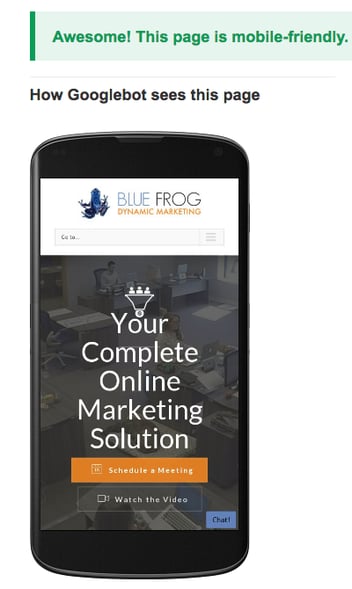
Mobile is everywhere—and your website lives or dies on its ability to reach users who are constantly on the move. Optimizing your site for devices like tablets and smartphones is absolutely vital to the success of your business.
There are a few basic elements that go into mobile-optimized design. Does your site utilize them all?
Responsiveness
A responsive website design is one that will format to fit any size of screen. Using a responsive web template, or hiring someone to design a responsive website for you, is essential to your online success. You’ve probably seen a few examples of websites with content that was too small to read, and you’ve had to zoom in and scroll to find the pieces of information you’re looking for. More often than not, people won’t bother to take the time and effort to do this, and without a responsive website, you’ll miss opportunities for new business. Making your website responsive ensures that visitors to your site can find what they need when and where they need it.
Pack In the Visuals
Colorful photos, bold headlines, videos, and infographics are much easier on the eyes than reading mountains of text and more effective at drawing your audience’s attention. Incorporating straightforward wording with a direct, well-designed layout is key for creating the ultimate user experience. Packing your content with visuals can greatly increase the usability of your responsive website while simultaneously making it look altogether more attractive.
Design for the “Fat Finger”
Tight spaces and small buttons make for a frustrating experience for your site visitors. Not only are small buttons and their offers or directions hard to tap, they’re also hard to read. Creating calls to action that are easy to read and use is key for user friendliness on mobile devices. Especially with a growing middle-aged and older mobile audience, bigger is better.
Keep It Simple
Phones, tablets and other portable devices are breeding grounds for distraction. Texts, Tweets, beeps, and buzzes are your website’s largest competitors when it comes to capturing the attention of your potential lead. The best trick? Keep your website as simple as possible. Be direct and intentional with your wording and design, and don’t make your contact forms, landing pages, or conversion process longer than your visitor’s attention span.
At Blue Frog, we know that creating a website for yourself or your business can be a daunting task. Our team of web designers and content writers is here to help. If you’re interested in talking with us about creating a mobile-friendly website, call us today at 515.221.2214 or visit our website at www. bluefrogdm.com
