Designing a website page that incorporates just the right balance of content, images, graphic elements, and calls-to-action (CTAs) can be a difficult task. Website pages vary in purpose, which can make it challenging to follow a recipe for a successful layout. While no one method is right for all purposes, getting back to the basics of design and understanding visual patterns like the ‘F’ and ‘Z’ can help simplify website layout and allow you to more effectively communicate with your visitors.
Basic Design Principles
Website designers should strive to create layouts with clear visual hierarchy and intentionally select how design elements are positioned and styled. Most website pages with high conversion rates use basic design principles like those below to draw attention to the most important page elements and keep users engaged.
- Scale is making certain elements larger or smaller another to draw attention to what is most important. An example would be to make one line of text larger than the rest to make that message stand out.
- Color sets the tone for the design and can also be used to make certain items feel related and harmonious. Learning more about color theory can also enable you to intentionally evoke specific emotions with your design.
- Contrast is the difference between juxtaposed elements. This can help certain elements stand out (like white text on a dark background), making the design more readable and creating emphasis.
- Alignment helps elements to flow cohesively down the page and makes the design feel segmented and organized.
- Proximity uses intentional grouping of design elements to show relationships between them. This can also be achieved by visually representing likeness, such as making three different icons all the same color to show they are a family.
- Negative Space is one of the most powerful—and often overlooked—design principles. You can use negative space (or “white space”) to make a design feel clean and structured by giving your text and design elements breathing room. This helps avoid competition among your design elements, making call outs and areas of emphasis clear for the user.
Design Patterns: F and Z
What Is the F Pattern?
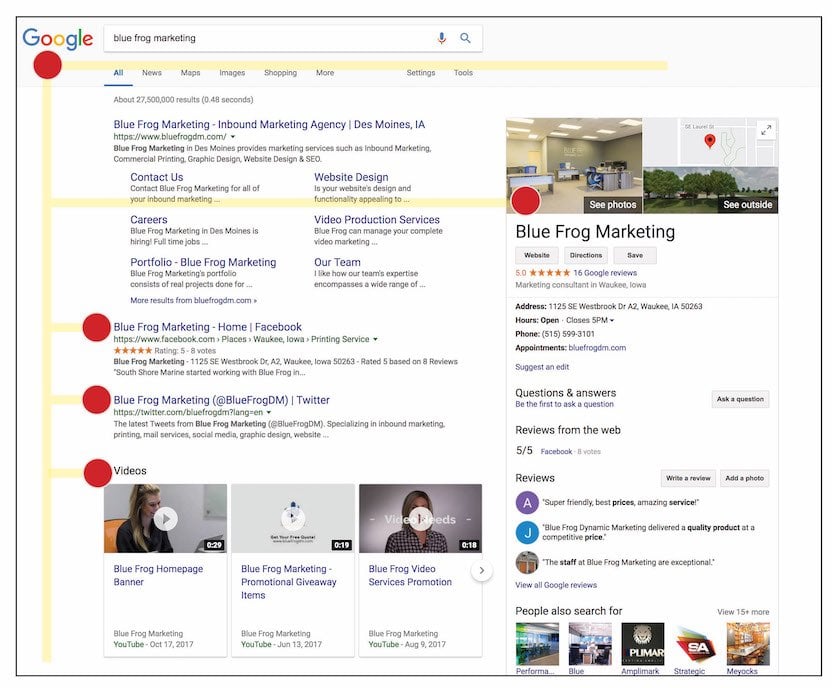
The F pattern traces a user’s natural eye movement when they are reading a website page. We read English from left to right; as a result, this pattern comes naturally to us. The example below illustrates the pattern, showing that the eye starts at the top left area of the page, works its way across, and then moves down to the next line. Most users tend to skim large amounts of text once they have grasped the general concept, so you can see that their horizontal movements tend to dwindle as they begin to just look for important section headings or paragraph beginnings down the length of the page.
Applying the F Pattern to Your Design Layout
Because the F pattern is primarily based on how a user is reading blocks of text, it tends to be more effective on content-heavy pages where the goal is to inform. Some examples of this include
- A blog or publication homepage
- An educational or resource page with a lot of information
- A landing page that covers multiple topics
- A blog post or online article
If you are working on a website page like any of the above, consider the F pattern in your design. Place an important element in the top left area of the page, and consider putting your CTA or secondary component on the top right. You can use alignment to place headers on a consistent path down the page get more glances from the user, and use proximity to group together similar content to make the page feel more organized.
What Is the Z Pattern?
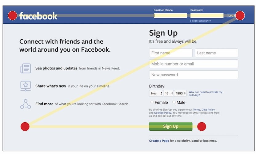
The Z pattern is similar to the F pattern in that it follows the user’s eye movement from left to right and then down, but when less content is used, the path simplifies into somewhat of a zigzag. The example below demonstrates how large design elements, rather than blocks of text, can lead a user from the logo on the top left to a CTA on the top right and then down and across towards the next major design element.
Applying the Z Pattern to Your Design Layout
The Z pattern lends itself more to pages that include concise, minimal text and bold design elements where the goal is to convert a user. Some examples of this include
- A landing page that focuses on a single offer or topic
- A sign-up or sign-in page
- A shopping page
- A standard website homepage
If you are trying to design a page with the Z pattern, remember that large, bold images and text are key. Less is more, as you want to avoid creating multiple competing elements. This is also a good opportunity to use color and scale to make certain elements stand out.
Choosing the Right Approach
When choosing which design principles and layout patterns to use on a page, keep in mind that no one approach is the “right” one. As designers, we have the freedom to innovate, experiment, and analyze our work to make informed design decisions. You can do this by conducting AB tests, using heat maps to track user behavior, and diving into page performance analytics. Finally, remember to ask yourself what the goal is of each website page, and let users’ needs and viewing platforms help drive your ideas.
Are you looking to improve your website’s design and performance? Contact Blue Frog Marketing to get a free consultation today. Share with us what your website goals and challenges are, and our team of experts can help you revamp or rebuild your website to be a lead-generating machine.