Web design is an ever-changing field that’s always developing new and better methods. If you think back to the 2000s, you probably remember very text-heavy, static websites. At that time, we only thought about creating a site for one screen size because desktop computers were the only type we interacted with.
As technology has advanced, we began to see websites on smaller screens like tablets and smart phones. As technology has gotten more complex, so have the problems with designing for user experience (UX). Responsive and adaptive design are two solutions to these problems.
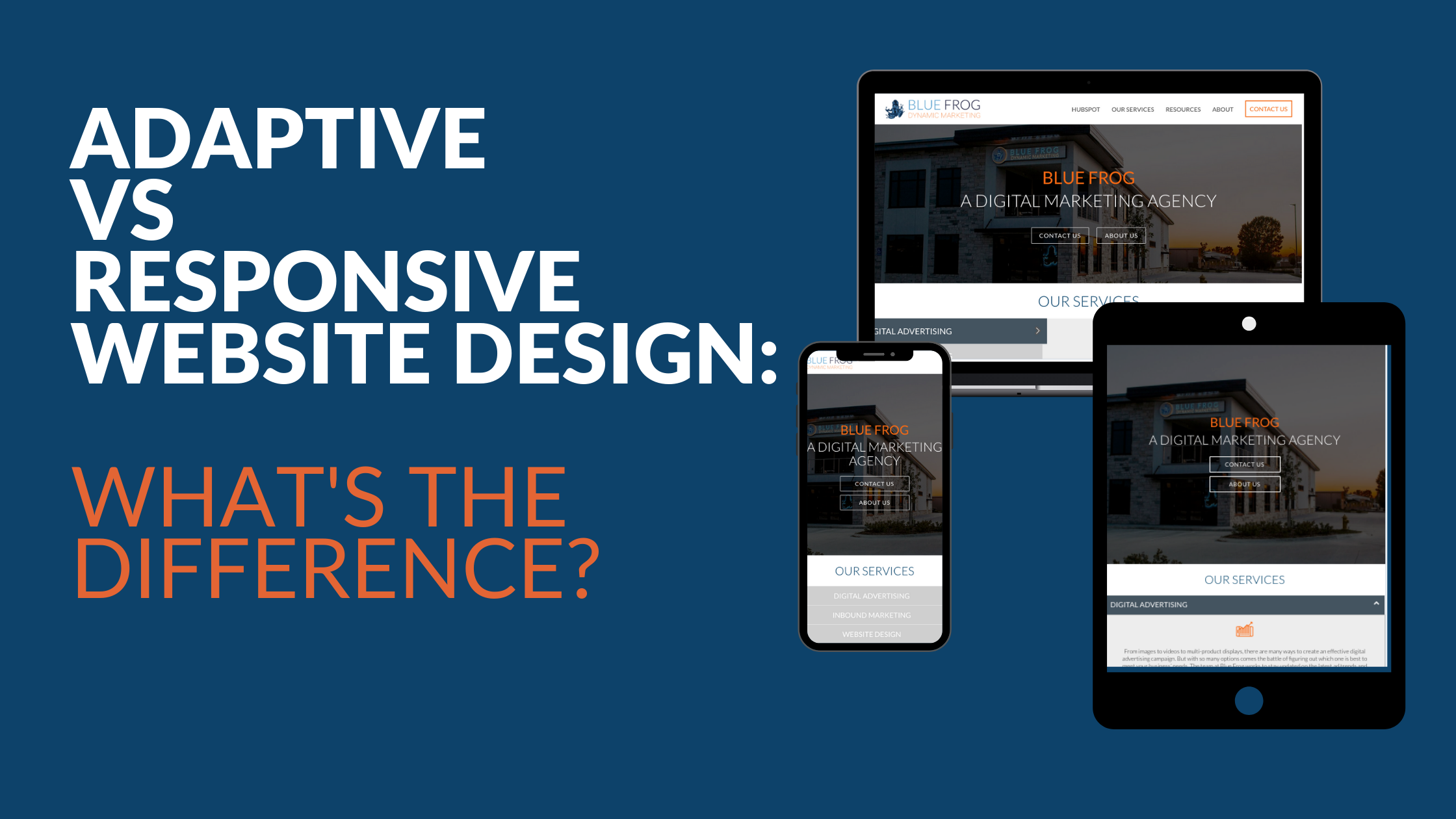
The quickest and simplest way to differentiate the two is to understand that a responsive site uses a single fluid layout that changes to fit any screen size. Adaptive sites use multiple static designs with breakpoints that signal the appropriate layout for various screen sizes. Now that we have a very simple, overarching view, let’s get into the pros and cons of each approach and how to know which to use for your specific needs.
Adaptive Website Design
Adaptive web design is less popular than a responsive design approach, but it can be beneficial for many sites. Adaptive sites use multiple fixed designs that automatically appear on corresponding display screens. So, resizing the browser does not have any impact on the design itself. A design is created for the six most common screen widths, ranging from large desktops to mobile devices. This way, the designer can create specifically for the needs of users that are most likely to use a mobile device over a laptop or vice versa.
Adaptive web design has the potential to look the best since it displays tailor-made designs for multiple screen sizes. The downside is that this usually creates a lot more work for the designer. On the other hand, sites that need specific capabilities for mobile sites (such as hospital sites that need user-friendly appointment schedulers), an adaptive design can feel more intentional since it requires more active planning.
Adaptive Website Design Pros & Cons
Pros
- Faster page speeds
- The UX designer has control over each layout and creates the optimal design for each screen size. Because of the multiple layouts, designers can add or subtract content for the different sizes if it makes sense in that field. For example,
Let’s say a restaurant chooses to use adaptive design for their site. They know that people coming to their site on their mobile device are usually looking at the location of the restaurant or even the menu to see if that is a place they would like to go.
But a user coming to the site on a desktop or a laptop might be looking for more background information since they are more likely to be in the awareness stage. With an adaptive design, you can display different content on the homepage based on the screen the user is on.
Cons
- Duplicate content on multiple sites can hurt your ranking in search engines.
- The design process is labor intensive.
Responsive Website Design
A responsive site is built on a flexible grid so that whether the user is on a desktop, tablet, or mobile device, the elements of your site remain constant and line up on that grid. For example, a desktop design is usually on a 12-column grid, a tablet would use 4 to 8 columns, and the phone shows in a single column. As screens decrease in size, the elements stack on top of each other. You can think of it like water taking on the shape of its container.
Responsive Website Design Pros & Cons
Pros
- A single url for each page accommodates any screen size (as opposed to adaptive design, which uses multiple urls for a single page). Since technology is always changing, this feature gets ahead of problems before they happen.
- The design process requires less time.
- Responsive design creates consistency across all devices, which is crucial for a good user experience.
- Responsive designs are better for SEO.
- Responsive designs are more popular, which results in an abundance of templates to utilize.
- Many of today's Content Management Systems (CMS) are created with marketers, not IT technicians or backend developers in mind. HubSpot's CMS Hub, for example, offers several pre-built templates with advanced functionality already built in – including responsive design.
Cons
- Responsive sites take longer to load.
- Responsive design requires more development time because it has so many moving parts. Since responsive design needs to be able to change to fit any screen, a lot of tweaking and auditing goes into the process before a site is ready to go live.
- Elements move around in responsive design, making it possible for images to be distorted or text sections to become too wide or narrow.
What should I consider when deciding which method to use?
Designers and developers need to keep the user in mind first and foremost. Considering who your specific users are will give you insight into their habits, including what devices they generally use to look at websites. If you know whether users tend to look at sites like yours when they are commuting and on their mobile device or like to look at content-heavy pages on their desktop, it becomes much easier to decide which method to use.
Time is another thing to consider when choosing your style of the site. On the surface level, adaptive sites require more up-front work since you're technically designing 4–6 different sites. On the other hand, responsive sites are more complex. This leaves more room for performance and display issues, which could result in more work later.
Are you considering a website redesign? Click here to read more about what you should consider during the review process.