It is well known that there is a small window of time to capture and hold the attention of your website visitors, so being intentional with your calls to action (CTAs) is critical to improving your conversion rates. In this article, we’ll share five tips for building effective calls to action so you can understand why your current CTAs might not be working, how to fix them, and start generating more qualified leads for your business.
1. Pay Attention to Word Choice
Effective word choice includes using relevant keywords as well as action words in your CTAs. Take the time to identify your buyer personas and understand what keywords they are using to research your products, services, or industry. By combining these keywords and action-oriented words, you can create a sense of urgency to take advantage of what your CTA offers.
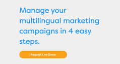
In the example below, the translation management software company, Cloudwords, generates excitement by clearly stating their product’s benefits first and then offering a free demo of their product so the user is intrigued to see it in action.
Supporting content: Manage your multilingual marketing campaigns in 4 easy steps.
Call To Action: Request live demo
2. Align Your CTAs with the Buyer's Journey
Every potential buyer who encounters your website is engaging in an active research process called the buyer’s journey. The buyer’s journey lens organizes this active research process into three primary stages: the awareness, consideration, and decision stages. These three stages represent the different levels of commitment to consider when presenting a CTA to a user. We’ll examine each stage to build an understanding of how and why it’s important to strategically align your CTAs with the buyer’s journey.
Awareness Stage
The awareness stage begins when a user becomes aware of their problem or pain point. This kicks off the initial research process and is the stage in which users are looking for informational and educational content. Awareness-stage content lives mostly on high-level pages, like a homepage or an overarching service page, as well as on blog and resource content pages. At this stage, users have a low level of commitment; they just want to find the most helpful information without needing to make a purchasing decision. Your CTAs should guide these visitors to the information they desire, whether that’s by creating a pathway to another page on your website, providing a downloadable resource, or presenting relevant blog content.
Examples of Awareness-Stage CTAs:
- Download Ebook
- Get Our Guide To [ ]
- View Our Blog
- Explore Services/Products
Consideration Stage
The shift from the awareness to the consideration stage happens after the user has clearly defined their problem and are beginning to research the various approaches or solutions available. As the user compares your offerings to competitors, you should be providing middle-of-the-funnel content that will answer their more specific questions about your services or products. The CTAs should appear around the middle to the bottom half of your webpage and focus on educating your user about your brand and services or products. This is a good time to offer free trials, demos, or in-depth resources like webinars and case studies.
Examples of Consideration-Stage CTAs:
- Start Your Free Trial
- Schedule a Product Demo
- View Our Case Studies/Webinars
- Subscribe to Our Email List
Decision Stage
The final stage in the buyer’s journey, the decision stage, is the one in which the user makes a final purchase decision. The CTAs at this stage should appear higher up on the webpage (likely in the top half) and will use decision-making language to encourage a user to make the purchase. It’s common for services and products to require a sales process that goes beyond the website, which means many decision-making CTAs will urge the user to get in contact with your team to finalize the purchase.
Examples of Decision-Stage CTAs:
- Request A Quote
- Contact Our Sales Team
- Schedule Your Consultation
- Get Started
- Sign Up
3. Design Eye-Catching CTA Buttons
A successful CTA strategically incorporates these three design components to capture attention: size, color, and animation effects. While there is no single color, size, or style choice that is best when it comes to designing your CTA, here are some helpful tips to consider about each element.
Size and Shape
The size of your CTA button can vary depending where it is on your website, but it should always be large enough that stands out against the rest of the text on the page. If you have a contact CTA in your navigation, for example, then you want to make the size just slightly larger than the rest of the clickable items in your navigation menu to draw attention to it. You also want to consider the shape of your button, which can contribute to making your button look larger than the other text around it. When choosing a shape, whether that’s a rectangle, oval, or something else, it’s important to consistently use that shape for CTAs throughout your entire website. As users are exposed to this CTA shape, they’ll quickly associate that button with an opportunity for them to act.
Color
Color can evoke a lot of emotion; some even say certain colors can build trust or create a sense of urgency. While there is a lot of psychology around colors, what’s most important when choosing your CTA color is that you choose one that contrasts with the colors surrounding it. A high contrasting color is going to draw the eye right to your CTA and indicate that it is an important piece of content.
Animation
Adding subtle animations, like hover effects, that make the button move or change slightly when you hover your mouse over it will indicate to the user that it is a clickable element. This is key to enhancing the user experience by making it easier for them to navigate through your website and know when to click on a button.
4. Consider What Info You Want to Capture from Your CTAs
There are a variety of ways to capture information with your CTAs using forms, gated content, email subscriptions, and more. Although lengthy forms may yield the most information and better-qualified leads, more users are likely to fill out a shorter form; it can be a battle of quality over quantity. When choosing the type and length of your form, think back to the buyer’s journey and where you place your CTAs. This can help define how and what information you should be capturing.
Short Forms, Email Subscriptions & Gated Content
In lower-commitment CTAs such as downloadable content or email subscriptions, you should only require a few pieces of information like email, name, and business name or professional title. In general, users are more likely to fill out shorter forms, and this allows you to capture information that feeds into a lead-nurturing cycle, such as an email campaign.
Long Forms & Questionnaires
Long forms and questionnaires will gather more information and more qualified leads for your business. These types of forms should occur on bottom-of-the-funnel pages, which users encounter when in the decision-making mindset. Those who are ready to purchase or move forward with your business are willing to provide much more detailed information about themselves, their business, their pain points, desired solutions, and more, in exchange for your product or service.
5. Use Proper Back-End Configuration in Your CMS
Finally, after carefully crafting your CTA, you have to bring it to life by properly configuring it in the back end of your content management system (CMS). In a CMS like HubSpot, you can customize your CTAs and create advanced filters so every lead that is captured is automatically segmented into a lead-nurture cycle or delivered to the right person on your team to handle the lead-follow up process. It also allows you to A/B test CTAs, link them to specific campaigns, and even create smart CTAs. You can continually evolve your CTAs to achieve the best conversion rates on your websites, blog posts, landing pages, and more.
Get Your Users Clicking!
While it may seem like a simple button, a CTA takes much more consideration and careful crafting than most may think. Using the knowledge of buyer personas, the buyer’s journey, design psychology, and back-end configuration, you can create a CTA that is sure to make your users click!
Need more tips on crafting CTAs? Check out our blog for more resources!