“Users don’t like to scroll” used to be a popular belief in the website design and development world. While research indicates that users’ attention tends to be focused above the fold, artfully facilitating long scrolling can provide powerful benefits to your website.
Best Practices for Scrolling
While most website visitors understand that they can discover more content if they scroll, various elements of a site can discourage them from doing so. In fact, ~45% of website content goes unseen for reasons related to user experience issues. Websites can benefit from small tweaks to improve how users interact.
Use Scrolling Points for Scan-ability
Scanning is many users’ go-to method for quickly identifying information that’s relevant to them because it demands far less mental effort than fully reading the content. Introducing scrolling points into your web design breaks content into clusters of relevant information with key points visually indicated. Failure to use scrolling points can lead to what’s called “scrolling fatigue”, which occurs when a user becomes bored, frustrated, or tired of the content on the page.
1. Zombie Scrolling
Zombie scrolling refers to users who have slowly lost focus, have tuned out of the content, and are simply scrolling without digesting any information. These users are far less susceptible to classic marketing calls to action (CTAs) and pop-ups and will often leave the page without any further interactions.
2. Rage-Quitting
While rage quitters are actively scanning the content looking for relevant information pieces, they become frustrated with scrolling when no visual indicators or separators are used. This phenomenon is often referred to as “tl;dr” (too long; didn’t read).
To avoid turning your website visitors into scrolling zombies or rage quitters, facilitate scrolling by breaking content up into digestible pieces; use points of visual interest such as images or graphics; and cater the content to your various target audiences. This will help users identify key takeaways and leave the site with beneficial, memorable information.
Avoid the False Bottom
Website users are more likely to scroll when they know there is more content to view. However, if a user thinks they have seen everything available, they can experience an illusion of completeness and leave the page. This occurs when the visible area on the screen appears to be complete or the user confuses an element for the bottom of the page.
Common design styles that can create this illusion include
Large Hero Graphics or Videos
While the hero image should be eye-catching and used to grab the users’ attention, hero graphics that are so large they push relevant content below the fold and contain no visual scrolling cues can create the illusion that there is no additional information to see.
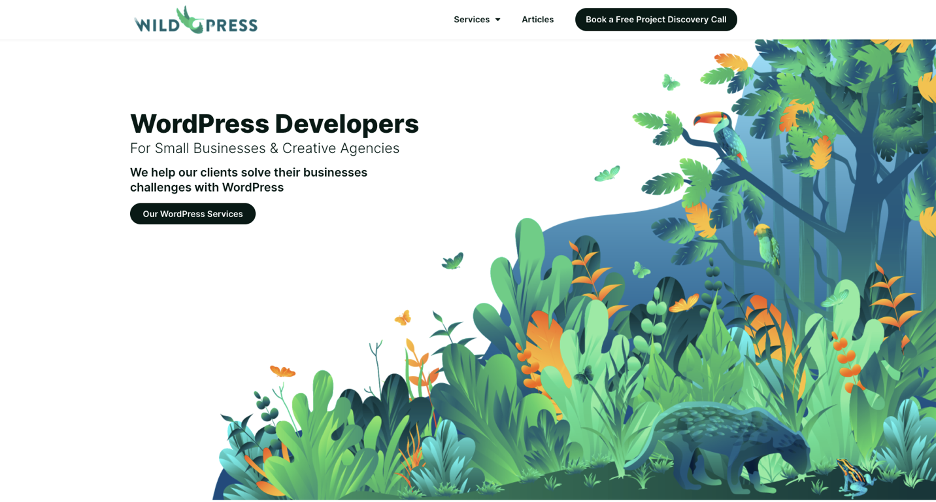
As seen in the example above, Wild Press’s hero graphic, while eye-catching, does not visually communicate that information continues below. However, there are a few variations you can make to large image heroes to avoid the false bottom effect:
Shorter Hero Images with Content Visible Below
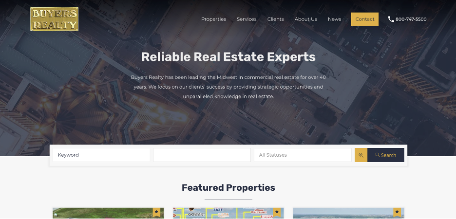
When you shorten the hero image, a portion of the content below can become visible. This gives the user a peek at additional content and entices them to scroll to learn more. You can see below how Blue Frog implemented this for Buyer’s Realty during their website redesign.
Scrolling Indicators
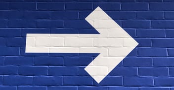
If you wish to keep the large image or video style, consider incorporating a visual element that tells the user there is more information below the fold. You can do this with a simple arrow, like Blue Frog’s client O’Rourke Hospitality did with their hero (see below), or with another graphic like a scrolling mouse.
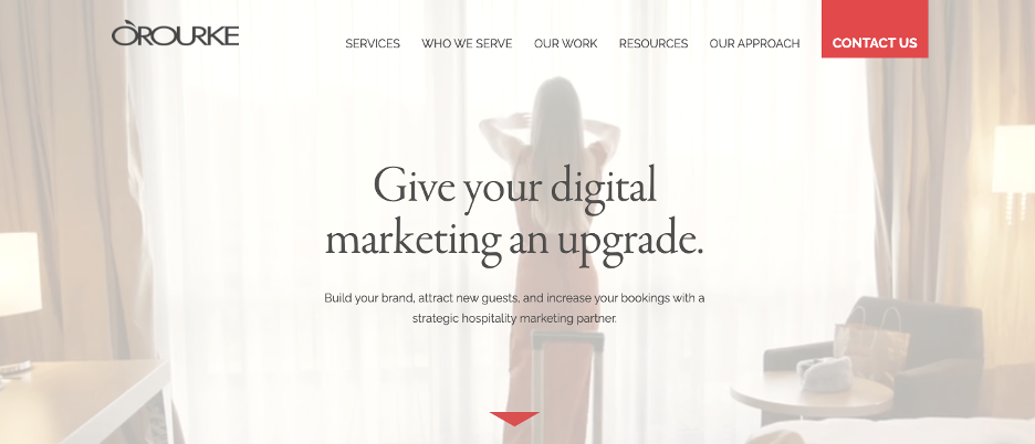
*Pro Tip: If you incorporate a scrolling indicator in your hero design, make it clickable and anchored to the next section of content on the page. Many users will instinctively try to click these elements.
Horizontal Lines as Separators
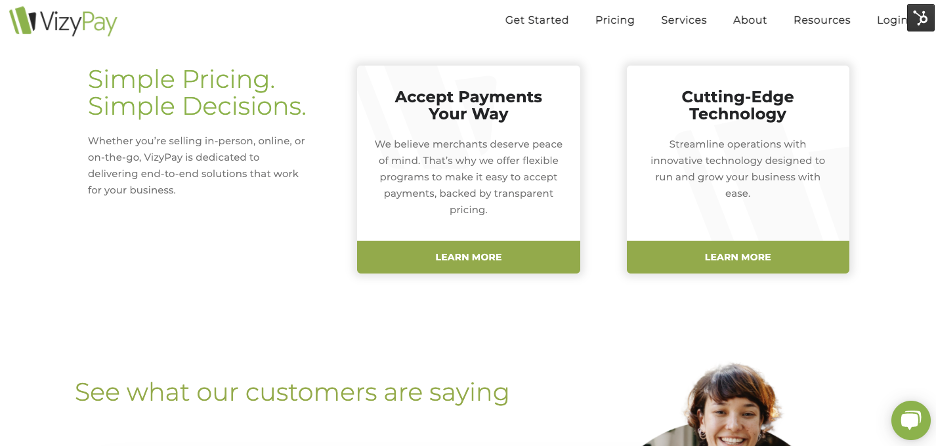
Overuse of horizontal lines can easily create the false bottom effect throughout a site. Because of this, many sites have moved to more open-concept styles that eliminate the use of stark horizontal lines. When every single section of content on a page is separated by a horizontal line or changing color blocks, it is very easy for a user to get a false sense of completeness because color changes and lines are commonly used to separate the footer from the rest of the page.
See how Blue Frog’s client, VizyPay, creates continuation between content elements by removing the background color contrasts.
Inconsistent White Space Between Elements
While utilizing white space rather than alternating color blocks, it is important to ensure your white space padding is consistent between elements. If too much empty space is found between two elements, the user can experience a false sense of completion and assume they have reached the footer.
Interruptions in Content Flow
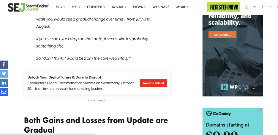
You want your website visitors to be engaged with your page content and actively scroll down as they read or scan the available information. If you interrupt their engagement or scrolling with unnecessary information, they can become frustrated by the user experience or get distracted from their goal and lose interest altogether. In the example shown below, you can see this article is interrupted by an advertisement. Depending on how far the user scrolls past the ad, they may not notice that the article continues further down. This interruption is a great example of creating a false bottom and disengaging the user as they scroll.
Adjust Navigation for Scrolling
Naturally, as a user scrolls further down the page, they are likely to find information they wish to learn more about. While relevant CTAs that lead users to other parts of the website should be placed throughout the page, some users prefer to use the navigation menu to visit other pages on the site. After they scroll far down the page, however, it can take a lot of effort to scroll back to the top to reach the navigation menu again.
You can avoid this problem by making the navigation menu easier to access in a couple of different ways:
Sticky Navigation
A sticky navigation or sticky menu is a fixed navigation menu on the webpage that retains its placement on the page as the user scrolls. Utilizing a sticky menu ensures the navigation items are always present and readily accessible for users.
See the example below of Blue Frog client, LinkSource, using a sticky navigation menu on their site.
Scroll-Up Activated Navigation
Scroll-activated navigation makes the menu quickly accessible without making it visible the entire time or requiring the user to scroll back to the top of the page. Instead, the navigation bar appears when a user begins to scroll towards the top of the page.
See it in action on Adobe’s blog:
Take your navigation a step further by optimizing it for both search engines and users. Check out our recent article about optimizing your navigation menu.
Back-to-Top Button
Some websites provide a back-to-top button that quickly jumps users back to the top of the page. If you choose to implement this button, we recommend you make it appear once the top fold is no longer visible rather than only when the user reaches the bottom of the page.
See how Blue Frog’s client, Pro Line Building Company, implemented this feature on their site:
Consider Jump-to Options
Sometimes users know exactly what they are interested in learning about and want to skip over all the other content on the page. By providing anchor text “jump-to” options, you can provide users with access to specifics right away. This style is commonly used in long form article content and can be included either as a side menu or in text links.
See how we utilize jump-to options in our blog posts:
As you can see, there are many best practices to guide you in creating a good scrolling experience for your website visitors. However, the user experience doesn’t have to stop there. With advanced features, you can turn scrolling into an immersive storytelling experience that highlights content and makes your site memorable.
Create Scrolling Experiences
Scroll-triggered Animation
As a user scrolls down the page, you can use animations to draw their attention to specific elements on the screen. The key with these animations is to have a specific reason for using each one. It is easy to overuse animations when you don’t have a clear intention behind them.
Here is an example of how Blue Frog used scrolling to tell the story of the services their client, Tech Service Today, offers:
Parallax Scrolling
Parallax scrolling is quickly becoming a popular animation feature in website design as it elevates the appearance and effect of the scrolling experience. In parallax scrolling, elements move at different speeds as the user scrolls, creating an illusion of depth on the page.
See it in action below:
Your site visitors will want to scroll through your web pages if they expect to find relevant, beneficial information as they do. When you understand how your website visitors interact with your pages and use intentional design principles, you can provide a memorable, enhanced scrolling experience.
Are you interested in learning more about how to enhance the scrolling experience on your website? Talk to our in-house experts at Blue Frog today to find out more.
