
Using a grid system is a tried and true methodology for designers, and it becomes increasingly important as the world of website design requires a responsive layout and an enhanced user experience. In this article, I will cover some common elements of a grid and the benefits of using a grid in website design.
What is a grid?
A grid is a set of parallel or intersecting lines that work serve as a system of organization. Much like a human skeleton, a grid is never seen by the naked eye, but it provides framework and structure to create a functional unit. Using grids also allows a design to be measurable, scalable, and repeatable.
Terminology and Common Grids
Grids comprise several sections, which allow them to be as simple or complex as a design requires. A grid does not need to include every one of these elements, but most website designs incorporate some combination of them in order to keep the layouts consistent and structured. Several of the common sections are outlined below.
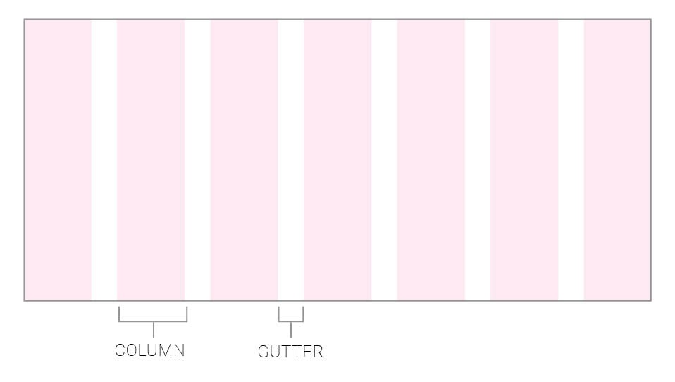
Columns are the initial segments that help establish the shape and size of the grid. Commonly, you will see these units as the ‘vertical rectangles’ that form the building blocks of the design.
Gutters are considered the spacing that falls in between each of the units. These can be adjusted to allow more or less white space between the units. Gutters serve an important role when you are designing a layout with multiple columns.
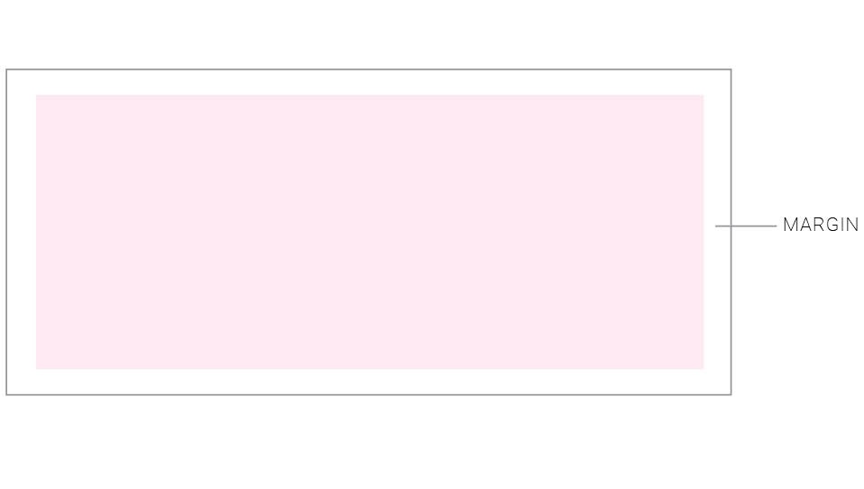
Margins define the white space between the edge of the page and the content of the design. They prevent the content from being cut off or difficult to read.
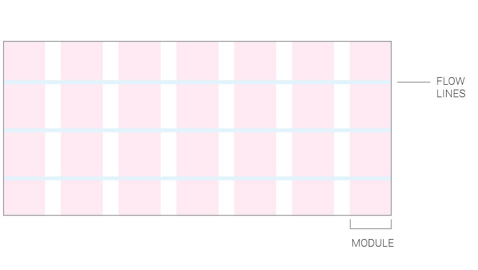
 Flowlines are the horizontal lines that break the space into rows. These create an additional unit of alignment for design elements that are placed across several columns.
Modules are formed when the columns and flowlines intersect and create a contained space. They can be thought of as the building blocks of the design.
 Common types of Grids
Most websites follow these common grid systems that help designers and developers follow a similar approach and achieve consistency and responsiveness across multiple website pages. These include symmetrical and asymmetrical grids, which define whether the elements of the grid are all equal or vary. There are also modular, hierarchal, and column grids. While a column grid is one of the most popular approaches to building a site, a combination of these formats can be used on a site to make it stand out.
One of the most common grid types is known as a 12-unit grid, which is extremely versatile due to its ability to break down into six, four, three, or two columns. This also helps establish breaking points, which help the designer decide how the design needs to adapt as the user views it on different screen sizes.
Applying Grids to Website Design
Utilizing grid elements in your website designs can strengthen the structure and organization of the page as well as provide consistency in spacing, scale, and placement of design elements. Not only does this organization improve the site aesthetically, but it can also make it easier for the user to scan the page and allow them to better navigate and process its content. Other benefits include
- Establishing visual hierarchy, which helps draw attention to the most important components of the design
- Making the design process more efficient by providing guidelines for the layout of the page
- Enabling the design to be reusable and scalable while maintaining consistent proportions
Are you looking for a partner in designing and building your website? Blue Frog Marketing can help! With offices located in Denver, CO, Des Moines, IA, and Huron OH, we work with businesses across the country to create beautiful, functional websites. Contact us today to learn more!
